Jason Rogenes is a conceptual artist that specializes in sculpture, I particularly remember him from one of this lectures because his work is so unique. His choice of medium to work with is Styrofoam, which right away sets him apart from other artists. Rogenes uses Styrofoam that is used in packaging and creates large-scale sculptures that are sometimes stories tall. Not only is he recycling but also he presents a different view of Styrofoam. They way that Rogenes showcases Styrofoam shows off this great form, shape, and lines, both concave and convex, that the viewer may have never noticed before.
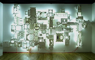 |
| "Stargazer 5.10" |
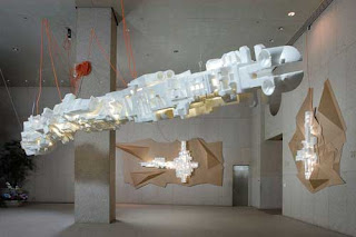 |
| "Transpondor 3.03" |
He also adds a whole other dimension to his work by lighting these sculptures from the inside and they transform into these futuristic looking structures. I also appreciate the fact that the viewer can look at his work from different angles and each time the sculptures take on different forms. I really love his work not only because it’s interesting but also the clean lines and varying shapes attract my eye. Plus, the scale of his work is mind blowing. His work makes me think more about the products that are thrown away daily, like Styrofoam. Rogenes has a great eye for detail in the way that he constructs these sculptures. I have great respect for his work and hope to see more from him in the future.


