Monday, September 27, 2010

3. E.V Day

"Bride Fight"

After we looked at a few works from E.V. Day in class I wanted to learn more because her work is pretty mind blowing. Day is a sculptor and installation artist, she explores various themes in sexuality and feminism along with imitating pop culture. She is known for her pieces that look like they are being blown up, she started this “Exploding Couture” series in 1999. The first piece in this installation was titled “Bombshell”, which is made of fabric and fishing line and is meant to bring to mind a famous image of Marilyn Monroe. Some of her recent work is a big installation in the New York City Promenade that consists of vintage clothing that is suspended.
"Bombshell"

Her work can be seen as conceptual art because there is new meaning behind these objects when they are shredded and suspended. Day’s work is something that I have never seen before but instantly loved it. Her craftsmanship and attention to detail is so amazing. Not only is Day’s work 3-Dimensional but also there are so many angles and dimensions that a viewer can approach it from that each time there is different experience. Even when she flips an article of clothing upside-down and suspends it there is a whole different way on seeing it compared to its original purpose. In one article that I came across in the New York Times, Day explained her work as, “futurist abstract paintings in three dimensions”. I quite enjoy her work and to every person it holds a different connotation. The idea that she shows all the pieces of an “explosion” and suspends them in air is brilliant and such an interesting way of approach sculpture. 
New York City Promenade Installation 
"Carmen"
"Cherry Bomb Vortex"

Sunday, September 26, 2010

5 artists


"Popcorn Youth"
paper plat


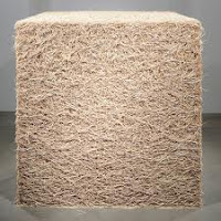
Tara Donovan works with everyday artificial products such as; paper plates, Styrofoam cups, and drinking straws that makes outsized sculptures. In reading about her I found the term biomorphic is used to describe her work because she uses organic shapes that look like they morph as you view her work. Donovan stated that she chooses a material before deciding what exactly she is going to create because she enjoys the idea of having endless options. Her work is extremely beautiful and shows that there is a lot of tedious work involved. 
pencils
toothpicks
  

styrofoam cups
plastic cups


Dominic Wilcox is said to be an artist, designer and inventor. Wilcox works with everyday materials, environments, human interactions, buildings and basically anything and everything; nothing is off limits. His work is meant to make the viewer think and see a new outlook on certain topics that are address in his work with the materials that are being used. Wilcox work is very interesting and creative but with an underlying intention of making the viewer look deeper.
army men


"War Bowl"
"Sneaker Cave"


"Xylophone Bin"


"Square Egg"


Brian Jungen is a Canadian artist who works under the realm of “found art”, like Marcel Duchamp. He is best known for working with sports equipment, especially Nike shoes. However, instead of leaving these objects “as-is” he changes their form to give them a different meaning from that of their original purpose. I like that he works with sports gear because it is something I have never seen before. I particular like the masks that he creates out of tennis shoes. Jungen art makes a statement and also expresses various cultural traditions at the same time.  

"Prototype for New Understanding
No. 10"


"Blanket No. 9"
made of professional
jersey


"Carapace"
made of rubbish bins
golf bags


cultural masks made of
Nike shoes and human hair


Rachel Whiteread is a sculptor and is known to form her casts from something that many of us don’t even pay attention to; negative space. These casts are done in domestic objects such as underneath furniture or even filling entire rooms. She is very well known for doing a concrete cast of a Victorian house, titled “House” in 1993.  Something that I thought was interesting that she said about her casts was "the residue of years and years of use". Her work is so amazing and something that I have never seen before, it definitely makes me notice negative space in a different way.
"Untitled (Library)"
House
Space beneath stairs


Space beneath chairs
"Ghost"


Willie Cole is known as a conceptual, modern-day sculptor, and visual artist. He works with everyday day domestic objects and transforms them by bringing them together in an art installation that makes a statement. Sometimes this statement is made through his use of a single object in a repetitive manner, which gives the object a whole new meaning. Cole’s work is beautifully crafted and is gives a whole new outlook on domestic objects. 
"Pretty in Pink"
"Hair Dryers"
Sculpture made
of  bicycle
handlebars
 
"Pressed Iron Blossom"
"Malcolm's Chicken"
made of matches

Friday, September 24, 2010

Conceptual Art - Project #2

Erin wasn't lying when she said this next project would be a hard one. I have never learned much about Conceptual Art until this class and it kind of blew my mind. Some of it I think is a bit of a stretch to call it "art" but it does give whole new meaning to everyday objects. Like the piece "Oak Tree" by Michael Craig-Martin, when I first heard what it was and the title I thought that I was a joke. However, after we discussed the meaning behind it made more sense. Michael, the artist, wanted us to think of an Oak Tree even though that wasn't what we were looking at; its actually quite clever. Than it was my turn to come up with a clever idea to create something for this project but I was stuck.

Oak Tree
What I have created so far
I had a bunch of ideas running through me head but  I still wasn't sold. At first I thought about making a bikini out of tape measures, to send a message about body size. I also had and I idea of getting a bunch of pink gum erasers, arranging them in a pattern and then drawing on them with Shaprie to convey the message that what is permanent can't be erased. After those and a few more ideas I still wasn't complete sold on what I wanted to do. Before class on Thursday I was standing in my kitchen just looking around asking myself what is something that I used everyday. It was when I saw the coffee filters and an idea popped in my head. I realized that I was going to take the Tara Donovan route with this project and work with and everyday material, like coffee filters, and create something with them in multiples. What I have started making with them kind or looks like and reminds me of coral reef that you would find in the ocean. As of now I like the direction I'm going and I hope that it turns out well. I  am extremely interested to see what my classmates are going to do because there are some many directions that are possible with this project.
Coffee filters

Sunday, September 19, 2010

Project #2: 5 Objects (lists)


Tap Measure:
            1.
-       Circular
-       Hard
-       White button on top that controls the length of the tape.
-       Tan and White
-       Rough on the edges
-       Silver tab (for pulling on)
-       White strip with numbers and lines

2.
-       Size varies depending on how much tape is pulled out.
-       Used to measure objects
-       Used from various reasons such as: sewing, construction, getting dimensions in a room, body measurements, ect…

Clothes Hanger:

            1.
-       Hard plastic
-       Triangular with curl at the top
-       Pink
-       Smooth
-       Tubular

2.
-       Used to hang up clothes.
-       Meant to keep clothes from getting wrinkled.
-       Is usually found in closets.
-       May hold expensive or cheap clothes (depending on the person).
-       May sit in a closet with no clothes.
-       Can be used to hang other items.

Sunglasses:

            1.
-       Purple
-       Plastic
-       Smooth
-       Hard
-       Two Circular Shapes (black)
-       Foldable

2.
-       Used to protect a person’s eyes from the sun.
-       An accessory.
-       Can be a fashion statement.
-       The meaning changes when worn inside of when it is dark outside.

Pushpin:

            1.
-       Clear and silver
-       Sharp
-       The top has a cylinder shape
-       Small
-       Hard
-       Smooth

2.
-       Used to hold papers on a bulletin board.
-       Can also be used on a wall.
-       The meaning changes depending on what its hold in place; an important announcement or just a picture.
-       Can hurt someone.
-       Sometimes used in practical jokes; place it on a person’s chair.


CD:
            1.
-       Circular
-       Smooth
-       Shinny
-       Reflective
-       Hard
-       Thin

2.
-       Hold music
-       May hold more meaning depending on the music.
-       Used in CD players, cars, laptops, ect…
-       May contain a number of different songs and genres.
-       Can also be blank.

Friday, September 17, 2010

Graphic Design


When I tell people that I am a Graphic Design major they usually respond with, “What do you want to do with that?” Since I have had this question come up multiple times I figured I could write a response to it in my blog. I have to say I knew that I wanted to major in Graphic Design when I first started high school and feel pretty fortunate that I’m certain about my degree. I really became interested in it when I was a senior in high school and took a Commercial Design class. Like with anyone who goes to college to receive a degree I hope that I will be successful in whatever my career brings. So what will I do as a Graphic Designer?
Roxy, one of my favorite logo designs
A business card I designed

It’s hard to say for certain but I would love to do design work for a company, like Roxy, and create designs for t-shirts, snowboards, stickers, and anything of that nature. To me that would be the ultimate job however, I’m also interested in working for a company that does design work for other businesses. In other words creating logo designs for new businesses or even redoing a logo for an already existing company. One of the projects that I had at my other college was to design a menu for a restaurant, which I really enjoyed. I have always thought that it would be fun to do product design and that is something I’m constantly paying attention to. Another aspect of design that I would think would be interesting is page layout for a magazine. I subscribe to a great deal of magazines and I’m always looking at the page layouts and even the advertisements, which is another area that I could go into as a designer. There is truly a wide range of jobs that I would love to apply my degree to and I’m always open to taking on different challenges. I look forward to what I have left to learn in school and to start a career in the Graphic Design field. 
Design for a pretend business I created

Wednesday, September 15, 2010

Sunday, September 12, 2010

Student Gallery

On Thursday when I attended Matt Bodett's Show "To Be Lost If It Must Be So" in the SUB with our class I was very intrigued by his work. I liked his work right away and thought that he was very talented but I was left with confused about what this body of work meant. There was a repetition of symbols through out his paintings, such as wrestlers embracing, medicine bottles, a wrapped hand, a boxing ringing, and X's. This was something that I had never seen before. After he spoke about his experiences and being diagnosed as having Schizophrenia I was so amazed because I would have never been about to tell. I think its amazing that he has come out of a really dark place and is a  functioning person making really interesting artwork for us to admire. Bodett explained what all these symbols meant to him and after he did it as if everyone in the room was able to relate to him in some way.

Diagram of a bug eye
One symbol in particular that showed up in his work that I thought was so neat was a diagram of a bug eye if I'm not mistaken. To Bodett it had a specific meaning about his outlook on life and what he has been through and sometimes it would be shown with x's through it, which gave it a whole other meaning.  The diagram itself is very intricate and many us had no idea what it was so it added this level of curiosity to his work. I'm very inspired by Bodett and he shows that it is possible to over come hardships in life. I have an uncle who is Schizophrenic and I have never been allowed to meet him because he refuses to get help or take medicine so its refreshing for me to see that a person can take this illness into their control. Bodett's work is a great release for him and I hope he will continue with is art because there is strong meaning behind it that is inspiring. 

Thursday, September 9, 2010

Journal in the Making

In the process of binding the book.

On Tuesday of this week in my Arts and Humanities Class we started the process of making our very own journals. I figure that this is something that involves creating so I wanted to blog about it even though it’s a work in progress. First off, the supplies needed are; sheets of paper (that will be folded in half), to pieces of cardboard, a long piece of string, a twisty tie that is used as the “tool” for binding, and whatever is desired for decorating. The first step is to fold all of the sheets of paper in half and then put five sheets of paper into a group; this makes it easier for binding. I did 5 groups of 5 sheets amounting to 25 pages. Next we had to poke five holes along the crease of the paper where the string is threaded to bind the book, which is the step I’m currently at. Binding it is pretty tedious but I know that when I’m done with it I will appreciate the work that I put into much more.
The supplies
(the fabric is what I will use to decorate)
"the tool" used for binding

The part I’m most excited about is to decorate the cover because we have free range to do whatever it is we want. I feel it’s more meaningful when I create something from scratch, because it would be just as easy for me to go buy a journal. I think its neat that our professor is having us make them. Not only will I fill the journal with my thoughts and drawings but the fact that I actually made it makes it more personal. It sounds cheesy but I think I will hold on to this journal forever. I’m excited to see everyone’s decorations because no two journals will be the same, which is the beauty in an art project. 

2. Rita Ternes


After talking about Rita Ternes in our first lecture I was really drawn to her work, so I thought I would write about her as one of the 3-D artists. Her medium is ceramics; she uses stoneware to create objects, which are then fired in a glass kiln. Through researching about her I found out she relates her ceramic work to dressmaking because with dressmaking forms are shaped my cutting out a pattern and assembling it into a 3 dimensional object. This is the technique that Ternes uses in creating her ceramic forms which I find very interesting.
Schale (shell/dish)


I personally love the elegance of her work, and the curvature of her ceramics. She adds an element of interest by painting bold lines on her pieces with shades of brown, orange, tan and blue. I can see where the relation to dressmaking show through in her art. She simply cuts one side of the piece and turns inward to create a whole new dimension. Her work also features convex and concave lines, which always add to the level of curiosity in piece. I feel that Rita Ternes is extremely talented in her field of work and it is easy to tell that she pays great attention to detail. 

Monday, September 6, 2010

Inspiration


A photo I took of "nature" that  I drew inspiration from.

I’m not entirely sure what to blog about at the moment but I thought I could write about what inspires me. First off, I feel that I should say inspiration is ultimately the jumping off point for a project and the beginning to a creative process. It’s where ideas are drawn from and transform into art that I can see and touch. So, what inspires me? I have always been and always will be inspired by the students that I attend classes with, specifically art classes. There is always so much talent in one room with and the beautiful thing is that not one person has the same style as another. I’m always learning from my peers and I draw inspiration from looking at their work, especially when they are better artists than me.
A photo I took was published in this book
and the work of other college students
in it is very inspiring. 


A painting I did that was
inspired by nature.
Beyond the classroom, I draw inspiration from whatever it is I’m surrounded by especially nature. Being outdoors has so much to offer to draw inspiration from because there are millions of shapes, colors, and forms. In addition I see things in nature as an art form in their own right. Being a Graphic Design Major I also find inspiration in business logos, posters, t-shirt, and basically anything with a design aspect. I’m constantly looking for new ideas and ways to approach projects and designs. Finding inspiration is key for me because it’s when my creative thoughts start flowing.